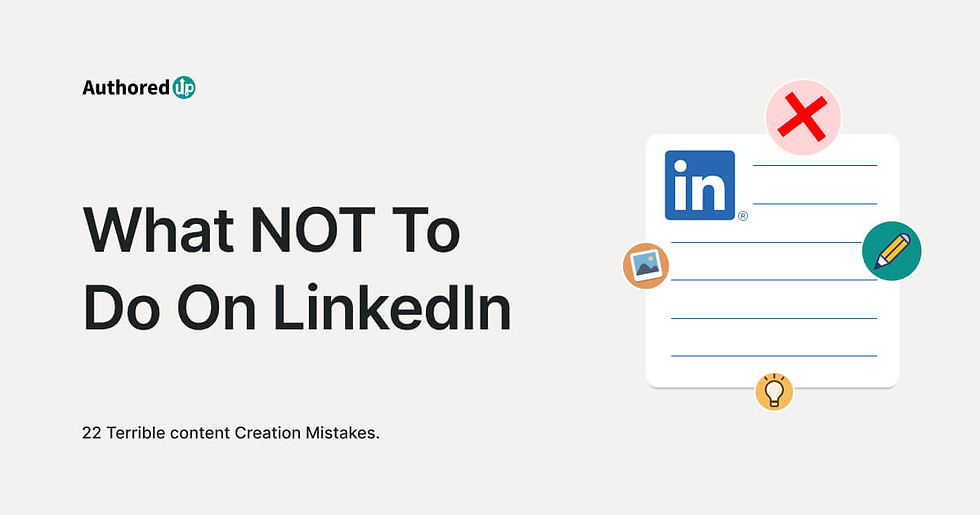
Common LinkedIn Cover Photo Mistakes That Hurt Your Professional Image
- harry4718
- May 4
- 3 min read
Your LinkedIn profile is often the first place where recruiters, clients, and professional connections learn about you. People usually focus on writing a strong headline, adding experience, and choosing a good profile picture, but many forget about one important detail, the cover photo.
The LinkedIn cover photo may look like a simple background image, but it plays a major role in shaping first impressions. A weak or poorly designed banner can make your profile look incomplete, while a strong one helps you appear more professional and trustworthy. Many users make simple mistakes with their cover photo without realizing how much it affects their profile. Avoiding these mistakes can help your profile stand out for the right reasons.
Leaving the Cover Photo Blank
One of the most common mistakes is not uploading a custom cover photo at all. LinkedIn automatically places a plain default background when no banner is added, and this often makes the profile look basic and unfinished. Your cover photo is valuable space that can support your personal brand and help visitors understand your professional identity faster. A blank banner does nothing for your profile. Even a simple and relevant cover photo creates a stronger impression and shows that you care about your presentation.
Using Low Quality or Blurry Images
A blurry or stretched image immediately reduces the quality of your profile. Since LinkedIn is a professional platform, image quality matters a lot. Low quality visuals can make your profile feel rushed or careless, even if your experience and skills are strong. This can negatively affect how recruiters or potential clients view you. Always choose a high resolution image that looks sharp and clear on both desktop and mobile devices. A clean visual helps build trust and improves the overall appearance of your profile.
Adding Too Much Text
Some people try to place too much information inside their cover photo. They add long descriptions, multiple services, contact details, and too many design elements all at once.
This creates clutter and makes the banner difficult to read. Your cover photo should support your profile, not act like a full advertisement. A short message, professional statement, or simple branding line is usually enough. Clear and simple banners are more effective than crowded ones.
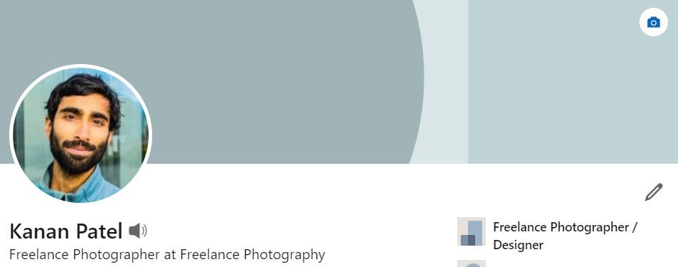
Ignoring Proper Size and Placement
Another major mistake is using the wrong image size. If the dimensions are incorrect, your banner may appear stretched, cropped, or important text may get hidden behind your profile picture. This can make even a well designed banner look unprofessional.
The ideal LinkedIn cover photo size is around 1584 x 396 pixels, and the profile picture overlaps the left side of the banner, so important content should be placed carefully. Proper layout planning helps your banner look balanced and readable.
Choosing Random or Irrelevant Images
Some users upload beautiful images that have no connection to their profession. Landscapes, unrelated stock photos, or random graphics may look attractive, but they do not support your professional identity. Your cover photo should help visitors understand your work and your personal brand. If you work in business, marketing, consulting, design, or technology, your visual style should reflect that space. A relevant image creates stronger branding and makes your profile feel more intentional.
The goal is not just decoration, but professional communication.
Forgetting to Update the Banner
Many professionals upload a banner once and never change it again. Over time, career goals change, job roles shift, and business priorities evolve. If your banner still reflects an old role or outdated message, it can confuse visitors and weaken your profile. Your cover photo should grow with your career. Updating it when you change jobs, start freelancing, launch a business, or begin job searching helps keep your profile fresh and accurate. An updated profile shows professionalism and attention to detail.
A Smarter Way to Create Professional Cover Photos
Creating the perfect LinkedIn banner from scratch can be difficult, especially if you are not experienced with design tools. Choosing the right size, text placement, and professional style takes time.
This is why many people use ready made templates instead. Templates help you save time while making sure your profile still looks polished and professional. They reduce design mistakes and make the process much easier. Using a professionally designed template can be one of the fastest ways to improve your profile without unnecessary effort.
Final Thoughts
Your LinkedIn cover photo is not just a background image. It is part of your professional identity and one of the first things people notice when they visit your profile. Avoiding mistakes like blank banners, blurry images, too much text, wrong sizing, and irrelevant visuals can instantly improve how your profile looks. A strong and relevant cover photo helps build trust, supports your personal brand, and increases your chances of meaningful professional opportunities. Sometimes the smallest improvements create the strongest first impressions, and your LinkedIn cover photo is one of them.
Comments